
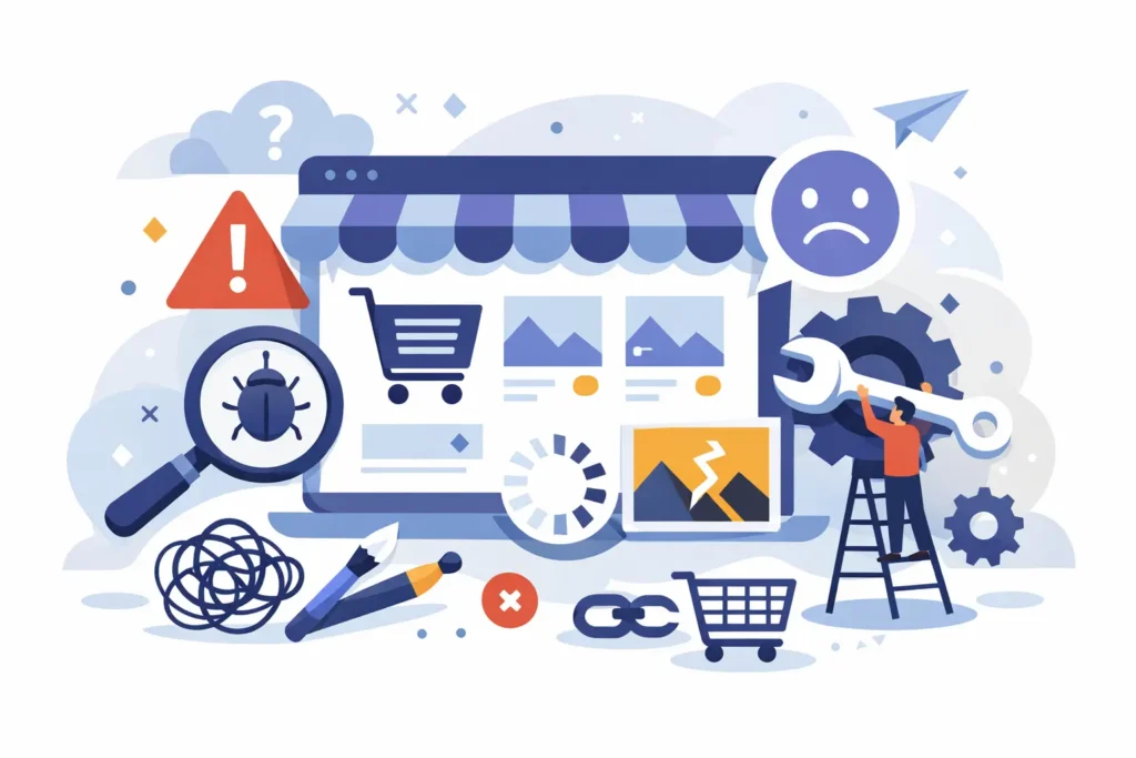
A BigCommerce store can look polished and still underperform. That is usually the problem. The top BigCommerce design mistakes are rarely dramatic. They show up as small decisions that make the site harder to shop, harder to trust, or harder to manage once the catalog grows.
Design is not decoration. In e-commerce, design controls clarity, speed, and confidence. If a shopper cannot figure out what you sell, how to compare products, or what to do next, the store is not doing its job. And if your team cannot maintain the site without workarounds, the design is costing you on the backend too.
Top BigCommerce design mistakes that hurt sales
One of the most common mistakes is designing for the homepage instead of the buying journey. Merchants often spend too much time trying to make the homepage say everything at once. The result is a crowded layout with competing messages, oversized banners, and too many calls to action.
Most shoppers do not enter through the homepage anyway. They land on product pages, category pages, search results, or campaign-specific URLs. That means your category structure, filters, product cards, and product detail pages carry more weight than the hero image ever will. If those pages are weak, a beautiful homepage will not save performance.
Another frequent issue is treating theme customization like strategy. A new color palette, updated fonts, and custom homepage sections can make a store feel refreshed, but that does not automatically improve conversion. The question is whether the changes support merchandising and usability.
It depends on the business model. A simple DTC catalog may do well with a clean, minimal presentation. A B2B or parts-heavy catalog often needs denser layouts, better specs visibility, stronger filtering, and faster access to account features. If the design ignores how customers actually shop, it will feel wrong no matter how modern it looks.
Mistake 1: Weak navigation and category structure
If shoppers have to think too hard about where products live, your navigation is failing. This happens when menus are organized around internal terminology, brand preferences, or legacy catalog logic instead of customer behavior.
BigCommerce can support complex catalogs well, but only if the structure is planned with discipline. Categories should help people narrow choices fast. Navigation labels should be obvious. Subcategories should reduce friction, not create another maze. When every menu item sounds clever but says very little, customers bounce or rely on search as a rescue tool.
Mistake 2: Product pages that make customers work
A product page should answer questions in the order shoppers naturally ask them. What is this? Is it right for me? What are my options? How fast can I get it? Can I trust this brand?
Too many stores bury the essentials. Variant selectors are confusing, size or fit details are missing, important specs sit in tabs nobody opens, and calls to action get pushed below oversized lifestyle imagery. On BigCommerce, product page design has to balance content with speed and clarity. Adding more modules is not always the answer. Sometimes the better move is removing distractions and tightening the hierarchy.
Mistake 3: Mobile design as an afterthought
This one still shows up far too often. A desktop layout gets approved, then mobile is treated like a compressed version of the same idea. That usually means banners crop badly, buttons stack awkwardly, filters become unusable, and product pages turn into endless thumb-scrolling.
Mobile design needs its own logic. Shoppers need fast access to search, filters, product options, and checkout actions. Tap targets have to be generous. Key content needs to appear early. If your store only works well for someone sitting at a laptop with patience, you are leaving money on the table.
Why top BigCommerce design mistakes keep happening
A lot of bad design decisions come from solving the wrong problem. Merchants often say they need a redesign when what they really need is better merchandising, cleaner information architecture, or theme-level improvements that support conversion.
Traditional agency process can make this worse. Too many people touch the project, strategy gets diluted, and design reviews become subjective. Suddenly the site is being optimized for committee approval instead of customer behavior. That is how you end up with stores full of custom sections nobody uses and critical shopping features left half-baked.
Another reason is over-customization too early. BigCommerce gives merchants a lot of flexibility, but not every store needs heavy custom design and development from day one. Custom work makes sense when it solves a real business need. It becomes a problem when it adds cost, complexity, and maintenance burden without improving usability.
Mistake 4: Filtering and search that do not support buying
For larger catalogs, this is not a minor usability issue. It is a conversion issue. If customers cannot narrow the catalog in a sensible way, they will leave.
Poor faceted navigation often comes from weak product data. If your attributes are inconsistent, your filters will be inconsistent too. If your product naming is vague, search quality suffers. Design and data are tied together here. The interface can only perform as well as the catalog structure behind it.
Mistake 5: Inconsistent visual hierarchy
A store should make the next action obvious. Too often, every element fights for attention at the same time. Promo bars, badges, popups, sticky elements, banners, sliders, and app widgets all compete in the same viewport.
This is where disciplined design matters. Not every offer needs equal emphasis. Not every message deserves a banner. If the customer cannot tell what matters most, your page has no hierarchy. And without hierarchy, conversion drops because the path forward is muddy.
Mistake 6: Trust signals in the wrong places
Merchants know trust matters, but many place trust content where it does little good. Awards get featured on the homepage while product pages lack reviews. Shipping policies are hidden in the footer. Return information appears late in the process. Contact details are hard to find.
Trust works best when it appears near decision points. On BigCommerce product pages, that may mean surfacing reviews, delivery expectations, warranty details, or clear availability messaging close to the add-to-cart area. The right trust signal at the right moment is more useful than a generic reassurance banner.
Mistake 7: Checkout distractions and cart friction
A cart page is not the place for design creativity. Its job is to help customers move forward with confidence. Yet many stores clutter it with competing promotions, vague shipping messaging, or upsells that interrupt rather than support the order.
BigCommerce has strong native checkout capabilities, but merchants can still create friction before checkout begins. Hidden fees, confusing coupon behavior, unclear shipping thresholds, and cluttered cart layouts all increase abandonment. Clean design here usually means fewer elements, clearer totals, and fewer surprises.
Mistake 8: Designing around edge cases instead of core behavior
Every merchant has internal stakeholders with special requests. A founder wants a bold brand moment. Sales wants every promo visible. Operations wants policy details everywhere. Marketing wants campaign modules on every page.
Some of those requests are valid. Most should not drive the whole design system. Your store should primarily support the most common paths to purchase. If edge cases dictate the layout, the main shopping experience becomes bloated and inconsistent.
Mistake 9: Building something your team cannot maintain
This is one of the most expensive mistakes because it shows up after launch. A store looks great in mockups, but the content model is fragile, the custom sections are confusing, and simple updates require developer help.
Good BigCommerce design has to work for the merchant team too. Can someone update homepage content without breaking layout? Can merchandising blocks be reused sensibly? Can category pages scale as the catalog changes? A design that depends on constant technical intervention is not efficient. It is a future backlog.
What better BigCommerce design actually looks like
Better design is usually less flashy and more deliberate. It starts with clear category logic, strong product presentation, mobile-first thinking, and realistic content governance. It respects the platform instead of fighting it. It also leaves room for growth, because the store you need at launch is not the same store you will need after six months of new products, campaigns, and operational changes.
That is why redesign work should be tied to business goals, not just aesthetics. If conversion is weak, identify where friction exists. If catalog browsing is messy, fix structure before adding more visual polish. If the team cannot manage content efficiently, simplify the system before layering on custom features.
For merchants on BigCommerce, the best results usually come from focused decisions made by someone who understands both platform behavior and e-commerce operations. That is very different from decorating templates or chasing trends. It is the difference between a store that looks updated and a store that works harder.
If your site feels busy, confusing, or harder to manage than it should be, start there. The fixes are often more practical than dramatic, and that is good news. In e-commerce, clear usually beats clever.
Sales in a slump?
Get instant access to the Conversion Boosting Self-Audit, proven to identify order-blocking issues on your website.
Plus, you'll get periodic tips, tools and exclusive offers designed to help grow your e-commerce business. Unsubscribe any time.
